Monday, November 29, 2010

Design is Dangerous: Excessively high heels


Season after season some of the most critically acclaimed footwear would be sky-high-heels. It seems that designers are competing for new and creative ways to make heels higher and more complicated to walk in. Doctors have frequently treated women with sprained ankles and broken bones due to the super high heel trend. They have said that women should try wearing a heel no more than 1.5 inches with an ankle strap. An excessively high heel puts pressure on knees, ankles, and hips leading to possibilities of developing Morton’s neuroma, bunions, hammertoes, or even Metatarsalgia.  The higher the heel means the higher the possibility of developing an injury or creating permanent damage.

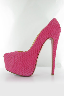
A Spring 2011 design by Christian Louboutin is a new spin on the classic stiletto platform that has been in demand for the past several seasons. The medium fabricating the hot pink pump is a python –skin, which gives both a haptic and optic texture. The 6-inch+ stiletto heels provide no support and leads to a higher risk of losing balance resulting in a sprained ankle. But it has a rather large platform and the trademark Louboutin red sole. The platform allows the heel to be taller, while maintaining a somewhat manageable means of still being able to physically walk in them. The higher the heel is traditionally congruent to the level of sex appeal. Aesthetically the silhouette of the heel is a classic design that is pleasing to the eye. However the time in which a consumer could walk in the heel is limited.  It corresponds with the old saying that “pain is beauty.” Women commonly ignore pain in order to appear more beautiful or desirable.

As long as excessively tall heels are in demand, designers will keep creating them. To keep the interest of the consumer heels will become higher and more dangerous. How far do the designers have to go to please the constantly evolving high-heeled shoe fetish? When is it enough?

Information on the dangers of heels:
http://news.bbc.co.uk/2/hi/health/5235630.stm
http://bodytreats.files.wordpress.com/2008/10/picture1.jpg

Image:
http://www.style.com/slideshows/accessories/spring_2011_rtw/christian-louboutin/shoes/14fullscreen.jpg
Design in Society: Utopian Design

Cube & Rect radio design:  WR03-CUBE/4B

 Utopian design aims to improve society and an example of a brand that is doing just this is Magno. Magno radios are designed with the environment and local economy in mind. Singgih S. Kartono was inspired by a popular Indonesian electronics company’s basic design principles. Katrono applied classic design elements to the Magno radios so that they would stand the test of time aesthetically as well as maintain efficiency. Salient characteristics of the various Magno radio designs are the uses of different types of wood, such as mahogany and pine. 

The WR03-CUBE/4B radio is a cube-shaped with radio receiving capabilities and an auxiliary jack to allow a wider range of uses. The use of pine, mahogany, and fabric in the Cube & Rect radio create a monochromatic color scheme of tan and brown hues. The dark brown fabric contrasts against the light pine wood. The pine is the main frame of the radio. The mahogany is mainly used for decorative accents such as the round knobs for dial changing. The external antenna has a small wooden sphere at the tip made of mahogany as well. 

 Singgih S. Kartono with his design 
The sustainable design of these radios is promoting a consciousness to be employed in the manufacturing of future electronics. More so, Kartono had the streamlined wooden design in mind to allow the radios to be easily produced in his home village, supporting his local economy. By supporting local villages and using sustainable resources, Magno is setting a terrific example of how social consciousness can be a successful business strategy.

Magno “Cube & Rect” radios: 
http://www.magno-design.com/?id=wr03c4b

Images: 

Saturday, November 27, 2010

Color Transforms


A clever use of color can help transform a design and effectively communicate the message of a designer without the use of words. An example of this would be an advertisement for “A Bird In Hand Project.” It utilizes color to express the urgency of cleaning the wildlife affected by the oil spill. The designer's color selection creates both a visual and symbolic contrast. Contrasting hues is what creates a focal point. Color dominance is found in the background image due to the bright image and presence of life. This vibrant image is of a sea turtle in its natural (clean) habitat. What helps the colorful background image show through is a frame created by what appears to be a hand that has smeared oil away. In the foreground there is an image illustrating the texture and dark, unpleasant appearance of oil. The murky appearance of the oil contrasts against the rich blue and green hues of the image of the sea turtle swimming in a clean ocean. Although the attention is on the bright image, you are reminded of the grim oil spill because the oil is not completely washed away and is blocking the viewer from seeing the beautiful image in all it’s entirety. The bright image creates an emotional response by creating hopeful reassurance that the wildlife will have a clean environment once again after people come together and help. It shows what it is and what it could be. The message that the color is helping to convey is that the vivid beauty of nature is being concealed by the dark, revolting oil. The beauty of nature will be restored after people come together to get their hands dirty and help wash away the human mistake.

A Bird In Hand Project: 
http://abirdinhandproject.com/

Image:
http://adsoftheworld.com/taxonomy/brand/a_bird_in_hand_project

Monday, November 15, 2010

Sustainable Design

Click to enlarge image
 The Blooming In The Wind tower in Dubaï is a self-sustaining structure using sails to generate power, collect dew, and create shade during the day. Tower occupants include conference spaces and a children’s library. It is made up of a metal frame with state of the art sails. During the day the sails assume a closed position to create shading. Also wind creates a vibrating effect of the sails that helps produce the tower’s energy. During the evening the sails assume an open position to collect dew from the cool night air. The sails are made of a material that has a cooling effect to ensure maximum dew collection. The dew collected the previous evening is used to provide the daily water for the visitors.

Click to enlarge image
The overall design of the tower is innovative and aesthetically pleasing. This tower has a continuously evolving visual appearance with the opening and closing of sails while promoting sustainable practices. Salient characteristics that make this structure unique would be its organic form similar to that of a flower budding at dusk and closing at dawn. There is a pattern created by the repetition of white geometric triangles that make up the intelligent sails. This creates a monochromatic yet graphic, visual texture. The bilateral symmetry creates a balanced composition.

The symmetry and rather large scale of the tower is reminiscent of iconic structures such as Egypt’s obelisks and Paris’ Eiffel Tower. An intelligent use of aesthetic design and sustainability awareness makes the Blooming In The Wind tower the zeitgeist for modern architecture. 

Information & Images:

Sunday, November 14, 2010

The Ergonomics of a Director's Chair


Ergonomic design can best be described as "optimizing human well-being and overall system performance." Some products are created to serve a general purpose but there are designers out there striving to improve the overall comfort and ease of use by applying principles of safety, comfort, ease of use, performance (productivity), as well as aesthetics.

To start off, the design of this director’s chair is simple and visually uncomplicated. The designs and patterns that can be used to fabricate the chair are vast. It is a fairly traditional type of chair. There is a wooden frame that makes up the arms, legs, and back frame. The back and bottom frames are used to secure sturdy pieces of fabric that are the general support of the back and bottom. The salient characteristics of a director’s chair is the main frame of the chair that is made of pieces of wood that cross to create the X-shape. These are in the front and the back to support the legs and assist in the folding of the chair. There are four pieces of metal that connect to the arms and X-shape to help secure the chair in a sustained upright position. This particular chair has graphic, contrasting striped fabric that makes up the back support and the seat of the chair. 

The safety of this director’s chair is made secure by having metal locking bars ensuring that the chair does not spontaneously collapse while somebody is sitting in it. The four legs create a most steady, uniform support system of elevation. Also, the X-shape creates a rather stable frame with the aid of the sturdy fabric that is used to lock the X-shape into place.

The comfort of the chair is questionable. There is little or virtually no back support. After a user tries to sit for an extended period of time one can begin to notice the lack of general much needed support. Having no clear back support system promotes slouching and prolonged sitting can result in exhaustion and strain. The lack of comfort in the chair and simplified design suggests a limited sitting time. The arms are thin, wooden pieces and do not provide much comfort for arms or shoulders either.

This chair is very easy to use. All one has to do is unfold the chair and lock the metal bars in place. It can be used when it is convenient or it can be set in place as a conventional, everyday seat. This leads to the next points of performance and productivity. The fact that this chair can compact and fold to be virtually flat makes it is easy to store and transport to wherever seating is needed. It successfully comprises elements that constitute a general seating system. Although, just maybe it is not comparable to other ergonomic designed seating.

The simplistic design and colorful appearance promotes aesthetic over comfort. Using a director’s chair is convenient because of its compact portability and storage. However, the lack of important ergonomic design limits the amount of appropriate situations in which this chair can be used for an extended period of time. It is most commonly a chair used out of quick convenience rather than much needed comfort and support.

Image:
http://www.housetohome.co.uk/imageBank/c/chair23.jpg

Information on Ergonomics:
http://ergonomics.about.com/od/ergonomicbasics/a/ergo101.htm

Sunday, November 7, 2010

Pro-NASA Campaign ii


Space exploration is commonly overlooked as an avenue in need of support for more educational and exploration endeavors. Catherine Roach’s design for Pro-NASA Campaign ii is a captivating use of word and image. The extraordinary image is of a crab nebula. It is accompanied with a white circular, planetary-shape with a geometric lattice around it. In the center are the words “such beauty exists and we can prove it,” that have a cut out appearance to allow the ground image peek through. The astonishing picture of natural beauty instantly engages the onlooker and captivates the movement of their eye with contrasting hues. The center graphic seems to blend in to the background. It is present and man-made but it seems to naturally coexist in the picture. The planet-like shape helps create harmony. It is integrated into the overall design without losing focus on the main picture of the crab nebula. The color white is a nice choice to be non-evasive and to maintain simplicity. White is commonly associated with purity. it is almost as if Roach is alluding to the pure beauty of space and the purity and authenticity of the statement. The statement engages the audience by placing responsibility in their hands, asking for support and the reader’s eagerness for more information. It also glorifies the people behind NASA by stating that they bring this beauty to the world, almost hinting at man being responsible for such beauty. Towards the bottom, there is a mission statement about NASA and questions that they ask themselves and questions the reader can start to ask. And to the right of the statement is the NASA logo. The logo helps identify who this message belongs to, who is responsible for such great astronomical work. The image and graphic together promotes the message of eagerness to bring more beauty to the world through space exploration. Overall, the image engages the audience by putting such beauty into the hands of man and making it attainable.  The message provokes a need for more education and a demand for more research.

Image:
http://www.flickr.com/photos/catherineroach/4617297754/in/set-72157623929645193/

Additional Information:
http://www.flickr.com/photos/catherineroach/4857043982/

Saturday, November 6, 2010

Word & Image: Blind Willow, Sleeping Woman

Designing the cover art for books is an ever-changing area of visual communications that demands a clever use of word and image in order to draw in a reader. An effective cover design can be seen in Chip Kidd’s work on Haruki Murakami’s book of short stories titled Blind Willow, Sleeping Woman. 

From the minute you enter a bookstore there are hundreds of books on front displays vying for your attention. There is an increasing demand for new and creative ways to capture the attention of the customer. The art of book cover design typically incorporates both word and image to lure the consumer into wanting to read more. Something that a designer must get right in designing cover art would be the spine of the book.


On a shelf with many other books of bland, uniform color palettes and monotonous play on typography, a spine with dusty lavender and the corner of a woman’s eye instantly draws attention. On the basis of Lauer’s book of Basic Design, human form and isolation creates an instant focal point.


When a customer takes the book off of the shelf to view the rest of the cover, they see the woman’s other eye. She is looking directly at the customer. The eyes of the woman leave you wanting more, it evokes curiosity. The image of the woman’s eyes looks like a screen capture from an old film. 

 There are bold, contrasting stripes of black, lavender, cream, cranberry, and a hint robin's egg blue. The black and lavender stripe contours around the woman’s eyes, which creates a progressive rhythm to the other stripes of red, cream, and robin's egg blue. The overall color palette is warm and subdued and looks like a book that would be found in a used bookshop. 

The layout of the text mimicks the shapes of the dominant image of the woman's eyes. The text used to state the author's name, Haruki Murakami, is placed horizontally next to the horizontal image of the eyes. Even this font has a look of 1960s nostalgia with a whimsical feel. The trail of letters that create the title are placed diagonally in the shape of the contoured stripe around the woman’s eyes, or even in the shape of an eye. 

The main image set the tone for the rest of the layout, including the layout of the text. Overall, the use of image and text is in a direct relationship, mimicking each other’s general shapes. The success of this cover design lies in its playful use of color and shapes.

Images borrowed:
http://photo.goodreads.com/books/1166065765l/9833.jpg

Additional information on Chip Kidd's design for Blind Willow, Sleeping Woman:
http://query.nytimes.com/gst/fullpage.html?res=9907EFDF1F30F933A2575BC0A96E9C8B63

Friday, November 5, 2010

Word & Image: Mom's Cancer by Brian Fies

Throughout the course of Design 1 and in Brian Fies’ lecture there has been a common theme of words and images coming together to create an effective form of communication. To go into more detail about Brian Fies’ lecture on Wednesday, one of the first topics he addressed was, indeed, that of words and images. He compared the use of words and images creating comics and the idea of rock music’s use of words and music. He went on to say that the music is just repetitive, and the lyrics are just “bad poetry.” But, when the two come together it can create an emotional response or define an era. As for his method of creating comics, he believes that the words would be nothing without the image and vice versa.


Specifically, the image in Mom’s Cancer where his mother appears to be isolated and drowning in a backdrop of medical jargon is a clever and effective use of combining word and image. The words do not have an immediate connection to what he is drawing but there is a visual representation that is explaining the idea that his mother is completely overwhelmed with all this new information that she cannot completely absorb it all. The words are the thoughts of Fies or possibly the entire family, but with the image there is an illustration explaining the internal experience of his mother. Not only is he conveying the issues of the family but the issues of his mother as well. In this example, the use of word and image compliment each other. Connecting word and image does not need to be literal, it can further emphasize a point or sometimes contradict to create irony. In the words of Fies himself it can “help illustrate the internal.” Once you have formed an idea into a cohesive set of words, the image can create another dimension of consciousness. The reader can be in the mind of the character or experience the true emotions behind a statement created by the author and/or artist. When words and images come together effectively the reader can make a correlation that will potentially amplify the overall experience.

Image:
https://blogger.googleusercontent.com/img/b/R29vZ2xl/AVvXsEi_CMQU2-AJJXJIykLiQBsjtDzSo44gy-jVQCRbnGrqa_JidkrMe5FgzfZzW4jJZzVptbaBVvWUWAGj1UlSurpXn4ndOnnF1lbtE7nFs6v28eQU99PzmaxEqEoraO0PfQysvdcZTFsrBTRC/s400/Drowning.jpg

Tuesday, November 2, 2010

Brian Fies talks to DES001

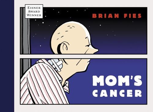
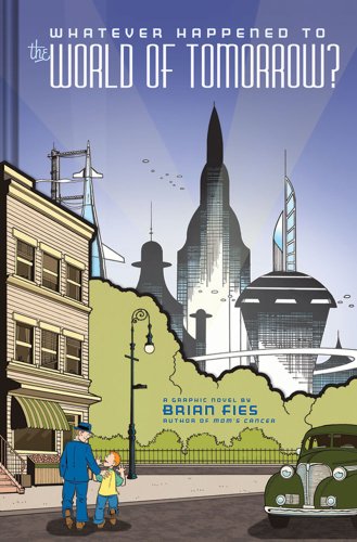
Today, Brian Fies, the writer and illustrator of Mom’s Cancer and Whatever Happened to the World of Tomorrow?, came to talk to DES001. It was not a typical lecture where jargon is thrown at the audience but rather it was informative and enjoyable. He kept reiterating that he was going to be ‘honest’. I really enjoyed how candid he was throughout the talk. He expressed that his second graphic novel Whatever Happened to the World of Tomorrow? was possibly not as successful at communicating his message as he had hoped. I liked that he was able to look at his work objectively and see possible faults. It is rare for someone to be able to look at their own work with a critical eye and see where there may have needed refinement.  However, in the end, he expressed that he would not have changed a thing. That is what being a designer is; always growing and constantly evolving but owning your work and taking full responsibility. I found that his lecture was both informative and entertaining. It was interesting to hear the amount of work that goes into creating a comic, from the individual pages to the cover art. It was humorous and interesting hearing about how obsessive he was about creating the authentic-feel of his vintage comic pages in Whatever Happened to the World of Tomorrow?. I enjoyed hearing about the purpose and thought process behind a few key pages in Mom's Cancer. I think that each individual track could benefit from what Fies’ had to say whether it is visual communications, fashion, or interior design. Particularly, the portion when he talked about editing and subtracting from his work. Lately, I have been running low on fuel but hearing Fies’ lecture got me excited about what I want to do in design. It just reaffirmed that I am struggling for a purpose and it helped me reset my sights on my goals. Afterward, I got my copy of Mom’s Cancer signed and he was completely humble and kind. It is great to see someone who has achieved so much in such a small amount of time with such a warm presence.  
 

Images:
http://sumthinblue.com/wp-content/uploads/2010/03/fies-moms-cancer.jpg
http://inkstuds.com/wp-content/uploads/2009/10/worldoftomorrow1.jpg

Brian Fies:
http://brianfies.blogspot.com/

Monday, November 1, 2010

Día de los Muertos & The Sugar Skull


Día de los Muertos is a long-held tradition of celebrating and honoring deceased relatives on November 1 and 2 in Mexico and in other various areas in the United States. There are all sorts of extensive work and thought that goes into this celebration. Traditionally, grave sites would be adorned with candles and marigolds. Family would sit next to the grave site and have meals together throughout the day. Also there would be the decoration of the sugar skull. They are graphic designed solid skulls made of sugar. A sugar skull would have a loved-one’s name written on the forehead and then elaborately decorated with icing, tin, sparkles, and sequins. They are often eaten but the main purpose is to decorate altars and grave sites. Sugar skulls come in all different shapes and sizes. The time-honored tradition is slowly diminishing, but the craft is something to be appreciated. There is truly no particular way of decorating a sugar skull, each is praised for their uniqueness. Salient characteristics would include flower petals painted around the eyes, swirling shapes, and vines. Floral and natural motifs are most common. The brightly colored sugar skulls create a wonderful contrast to the pure white base. The goal is to make each skull unique and captivating. It is to reflect the spirit of a loved one and their salient characteristics. A sugar skull’s decorative pattern is commonly, but not limited to, bilateral symmetry. It is a struggle year after year to keep these intricate, beautiful sugar skull decorating a part of the yearly festivities but we can appreciate them while they are still around.